Animal friends.
A redesign of the quote & booking engine.

INTRODUCTION
In our pursuit of excellence in digital services, we embarked on a transformative journey to revamp our quote engine (QE), a critical component of our website facilitating insurance policy suitability & selection.
We aimed to enhance user experience and pioneer a mobile-first approach, aligning with evolving consumer preferences.
This case study delves into our collaborative efforts, methodologies employed, and the outcomes achieved.
INTRODUCTION
As the Head of Digital Product Design at Animal Friends, my role was to spearhead a team effort focused on revolutionising our digital presence. Together, we prioritised customer satisfaction by centring our design philosophy around their needs and preferences. By fostering a user-first mentality, we elevated product quality and satisfaction levels, resulting in a transformative shift in our design culture.
Explore how users’ experience of the per insurance engine can be improved to increase conversion, ensuring that people get the right products for their needs.
PROJECT OUTCOMES
Our outcome was to enhance user experience by pioneering a mobile-first approach to our legacy quote engine, aligning with evolving consumer preferences.
CLIENT
Animal Friends
PROJECT SCOPE
3 Designer, 1 Product Owner, 1 Project Manager, 1 Product Delivery Manager, Internal Development Team, & Compliance Team
TOOLS
Figma, Adobe CC, Trello, Miro, Axure, Jira, Teams.


Case study
Our process
Empathise
The first stage of the Design Thinking process is to develop empathy for the users. This means understanding their needs, wants, behaviours, feelings, and thoughts, and why they exhibit them when interacting with products in real-world settings.
")
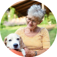
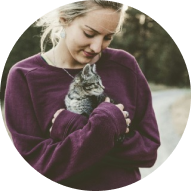
The diverse users of Animal Friends
Framing problem statements for our cohort of users and their journeys.
Engaging in stakeholder consultations to align project objectives with organisational goals and regulatory requirements. Through multiple rounds of usability testing, we identified four different cohorts of users.

Aggregators
A significant portion of our traffic comes from meta partners (aggregators). These users have already identified their needs and preferences through sites like Compare the Market, where they can view our prices and policies alongside those of other providers. By the time they reach us, they have already found the best offer, and want to evaluate our credentials.
Direct
We had a small portion of users who came directly to our website. As part of our business strategy, we aimed to increase this segment since the acquisition cost was much lower than that of users from aggregators. These users often struggled to understand the nuances of our policies, what they covered, and how to find the most suitable level of coverage.
Multi pet
Many users inquired about multi-pet policies and had difficulty understanding if we offered them and how to add them. This issue affected both direct and aggregator traffic.

Overwhelmed
The user who finds navigating insurance policies confusing and time-consuming often feels overwhelmed by the amount of information and the complexity of choosing the right coverage.
What we learned about out users
Deciding on the most suitable policy can be paralysing.
Moving into our first cross-discipline workshop, we reframed our higher-level objectives into a set of more defined user jobs. This made it easier for our engineering team to foresee the possible technical constraints that each possible solution might bring.

Synthesising pain points
Synthesising pain points


Defining and prioritising solutions
Utilising user jobs across our personas to further define our solution scope for an MVP.
In the exploring phase, we mapped the existing user journey and conducted desk research to understand the current landscape and competitors. During the conception phase, we explored various possibilities through “How Might We” (HMW) questions.
How can we simplify the process of choosing a policy and coverage?
How might we display our expertise and value at the right time?
How can we make it clearer that customers can request a quote for more than one pet?
How might we minimise the effort and friction involved in obtaining an initial quote while ensuring that users remain engaged in the process?
Ideation
In the prototype, test, and iterate phase, we developed clickable prototypes and conducted two rounds of usability testing, followed by design iterations and amendments based on the research findings. This process also facilitated the product team’s brainstorming, making it easier to develop concrete design ideas as we transitioned into the ideation stage.
Legacy designs


Rapid prototyping ideas


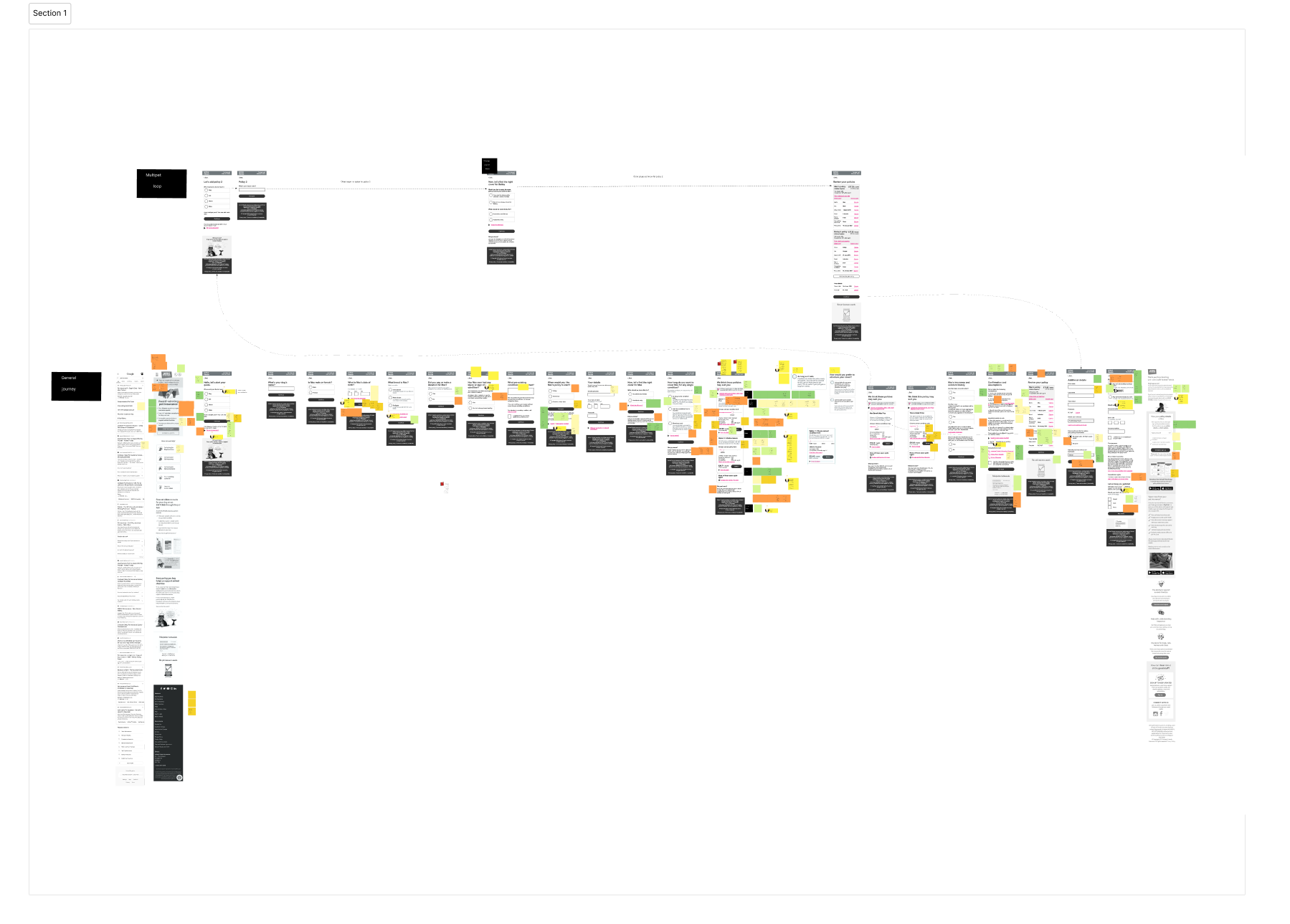

Ideas to address hurdles
One task per page
A one-thing-per-page approach helps focus the user on one specific task. The benefits, it reduces cognitive load dealing with a single task at a time.
Allows help information to be shown only when needed.
Gives a feeling of momentum and reduces scrolling Handles branching and errors well helping to address some of the concerns raised by our overwhelmed users.
Before

After

Ideas to address hurdles
Reduce questions before the quote to
a minimum
Users coming directly to our site are often hesitant to submit personal information, as they are primarily in the “window shopping” phase and fear that their details may lead to unwanted contact.
To address this, we aim to reduce friction by only asking for essential information needed to provide a quote and display policy options.
This approach helps users access the information they want more quickly and minimises their reluctance to proceed due to concerns about providing detailed personal information. We also chose to ask the pet’s name and users seemed less reluctant to give this information up.

Ideas to address hurdles
Contextual help and timely information
Utilising radio buttons positions explanatory text directly alongside the choices, eliminating the need for users to cross-reference information from other parts of the page.
Using details components rather the modals helps to expose additional help text alongside the question the users need help with.
Bringing important information to the forefront at the right time allows users to act on it immediately, reducing surprises and enhancing their overall experience.

Ideas to address hurdles
Self-promotion and reassurance
We engage in significant charity work that isn’t currently visible during the user journey. Users care about the organization behind their policy and seek reassurance about its credibility.
Highlighting our charitable contributions can enhance trust, as users want to know that the company they are entrusting to protect their family members genuinely cares about animal welfare and well-being.

User Feedback Summary
We conducted structured remote interviews with 10 participants over two rounds.
During our user testing, participants interacted with the updated version of our website, and their feedback highlighted several key strengths:
Simplified Policy and Coverage Selection
Users found the process of selecting policies and coverage options to be straightforward to navigate. The clear, step-by-step guidance was especially appreciated, helping users feel confident in their choices without feeling overwhelmed.
Expertise and Value Displayed at the Right Moments
Participants valued the well-timed presentation of information that showcased our expertise. They noted that the expert tips and advice were helpful and accessible, making them feel supported throughout the process.
Clear Multi-Pet Quote Requests
The ability to request quotes for multiple pets was clearly communicated, and users recognised this as a valuable feature. Many testers mentioned that they were likely to use this option, thanks to its prominent and clear presentation.
Effortless Initial Quote Process
Users praised the ease of obtaining an initial quote, noting that the process was quick and required minimal effort. The smooth, engaging experience kept them interested and motivated to complete the steps, with many expressing satisfaction with how hassle-free it felt.
Overall, the feedback from users was highly positive, indicating that the updated design effectively met their needs and enhanced their overall experience on the website.


No Posts Found