LUXTRIPPER
Creating a Unified Design System for Luxtripper
As the sole member of the design team, I faced the challenge of limited capacity and resources. With a growing demand for design work across various departments, it became evident that our current approach was not sustainable.
Non-designer colleagues were often left waiting for design assets, slowing down their development processes and leading to inconsistencies in the final product.

The problems
As the sole member of the design team, I faced the challenge of limited capacity and resources. The growing demand for design work across various departments made our current approach unsustainable. Non-designer colleagues often had to wait for design assets, slowing down their processes and leading to inconsistencies in the final product. We also had no single source of truth, different departments would interpret legacy design guidelines, differently and inconsistently. When it came to building out designs elements and UI components were different from page to page, even as far have having different girds, pages widths, fonts and sizes. All this lead to a fairly consistent experience for users.
Challenges
One of the biggest challenges was that this project was not on the roadmap. There were little to no brand guidelines, and each project had been created with loose documentation.
Project Overview
I undertook the task of developing a much-needed design system for Luxtripper’s website and back-office systems. The primary goal was to maintain simplicity and flexibility, ensuring the system could be effectively utilised, even with limited capacity and a “build as you go” roadmap.
My role
Lead designer
Interaction designer
Visual designer
Design system
Project manager
Solution
To address these challenges, I spearheaded the development of a MVP design system tailored to our company’s needs. This design system included:
- UI Components: A library of reusable UI elements, such as buttons, forms, and cards, adhering to our brand guidelines.
- Visual Guidelines: Instructions on typography, colour schemes, and iconography to maintain visual consistency across all platforms.
- Documentation: Detailed guidelines on using the design system, ensuring even non-designers could create development-ready visuals that met company requirements.

Consistency Challenges
Upon joining Luxtripper, it became evident that we needed a single source of truth. The growing demand for design work led to inconsistencies, such as varying grids, font sizes, and tones of voice across different customer touchpoints. Digital platforms—including the website, back-office systems, and marketing emails—had different looks and feels due to independent development. This resulted in design inconsistencies despite an outwardly polished appearance, which was problematic for a luxury premium brand.
The documentation was not centralised, meaning different departments had access to outdated material, resulting in a disjointed style guide. The absence of a unified design source caused confusion among designers and led to duplicated components, frustrating developers and complicating the user experience. Users had to navigate multiple UI patterns to perform identical tasks, which would only become more problematic as the product team expanded. With no dedicated budget or resources for a design system team, we tackled the task incrementally, creating new components and styles gradually.
Audit and Organisation
The first phase was to audit what was currently live and begin organising our existing assets. This wasn’t a rebrand but rather a formalisation of what we had. My goal was to create a single, centralised location where other teams within the company could access up-to-date design resources. This would also aid me personally in conducting my day-to-day tasks more efficiently. The approach was to get a first-phase Minimum Viable Product (MVP) out to create a source of truth for both designers and developers.

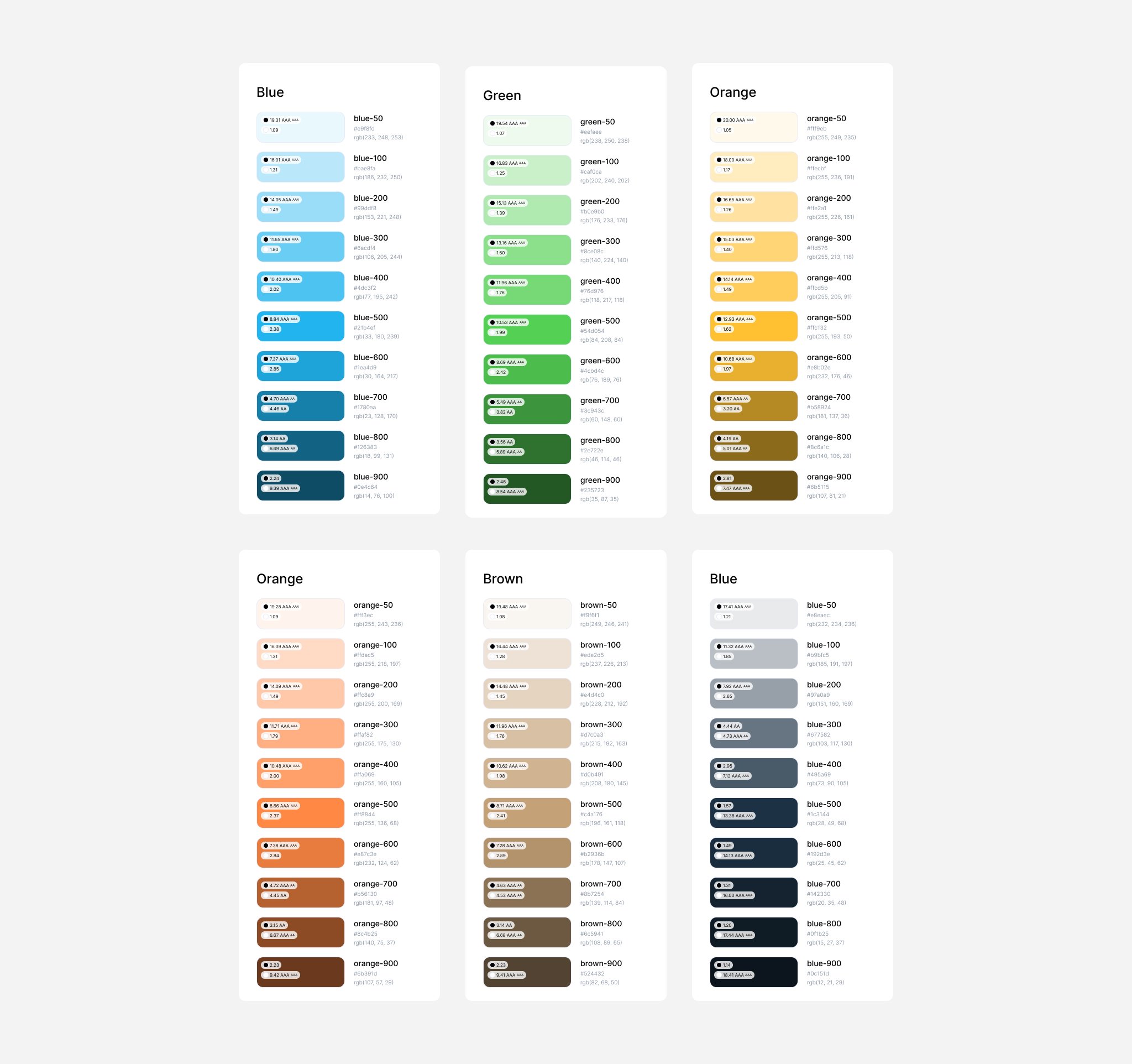
Existing Colour Palette
The existing colour palette was overly complex, with many shades of grey leading to confusion. I simplified it into a functional palette using harmonious shades of the primary brand colours:
- Use colours sparingly and functionally.
- Prefer shades of navy over grey for a cohesive look.
- Blue for actions, green for payment-related actions.
- Use yellow sparingly on dark backgrounds as a highlight.
Existing colour palette

Updated colour palette
Icons
We had a large variety of icons sourced from different sets, creating a disjointed experience. To speed up the process, we adopted an existing set of icons:
Existing icon family
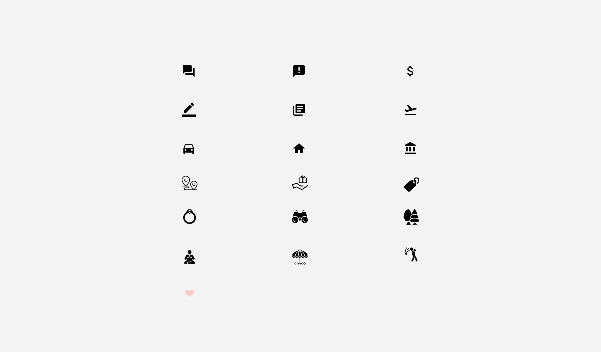
Updated icon family

Typefaces
Luxtripper was in the middle of a font migration, using different font scales on each page. We revisited the type scale using Type Scale and chose a scale similar to both our legacy and newer scales, creating a new source of truth for all departments:
Existing typefaces and scales

Updated typefaces and scales

Buttons, buttons, and more buttons
The first step towards an optimal design system was auditing our existing styles and components. We aimed to reduce variations and create a simple selection of buttons. Our objective was to develop a functional collection of buttons and expand on them as needed:
Existing buttons
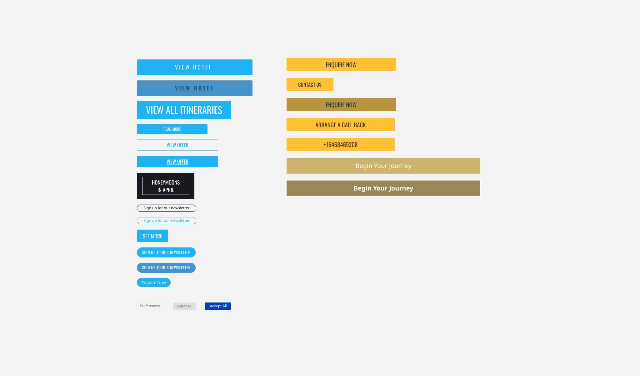
Updated buttons styles
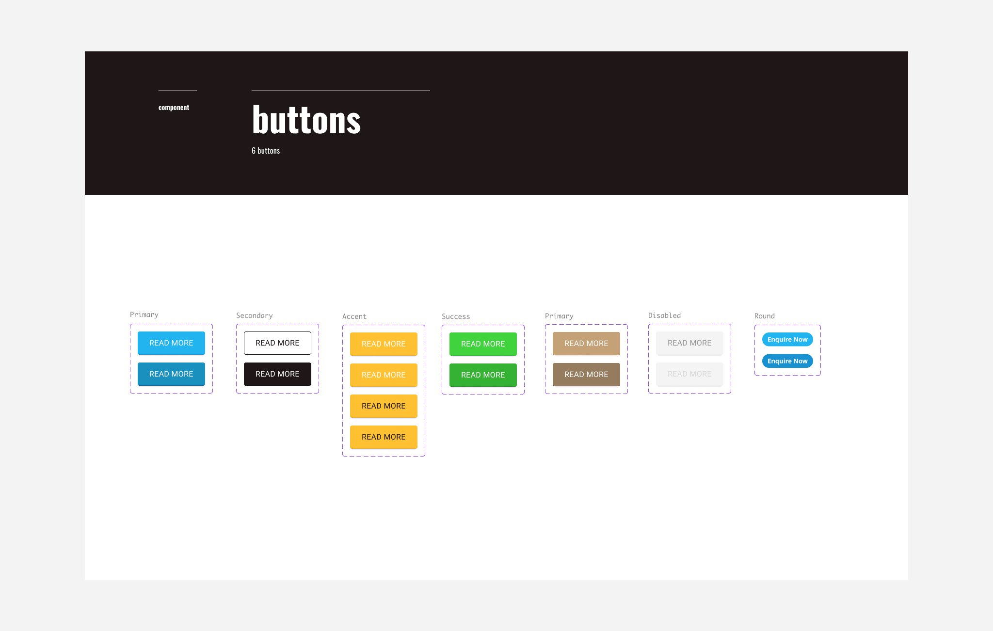
Building a Component Library
Following the audit and setting global style guidelines, the next step was creating a component library. We also created templates for main screens to demonstrate component groupings for various use cases, facilitating faster design mock-ups. Due to limited resources, we couldn’t rebuild everything simultaneously. Instead, team members collaborated to apply new styles and eliminate old components during their regular tasks, prioritising high-impact elements like colours, headers, footers, and buttons. This gradual approach led to a more consistent user experience across all platforms.


Encouraging Adoption
A design system is ineffective if unused, so I focused on promoting it within the product team. I conducted workshops to familiarise designers with the system and synchronised the Figma file enabling developers to inspect components.
Due to limited resources, we couldn’t rebuild everything simultaneously. Instead, designers and developers collaborated to apply new styles and eliminate old components as part of the process when looking at road map features, prioritising high-impact elements like colours, headers, footers, and buttons. This gradual approach led to a more consistent user experience across all platforms.
Value Added
Although the system was very basic, implementing the design system had several key benefits for the company:
- Empowering Non-Designers: With the design system in place, non-design colleagues gained the ability to create dev-ready visuals without needing extensive design expertise. This empowered them to move faster and be more autonomous in their projects.
- Enhancing Consistency: The design system ensured a consistent look and feel across all company products and platforms. This consistency helped strengthen our brand identity and improve user experience.
- Scalability: As the company continued to grow, the design system provided a scalable framework that could easily accommodate new features and products. This allowed us to maintain efficiency and quality without needing to significantly expand the design team.
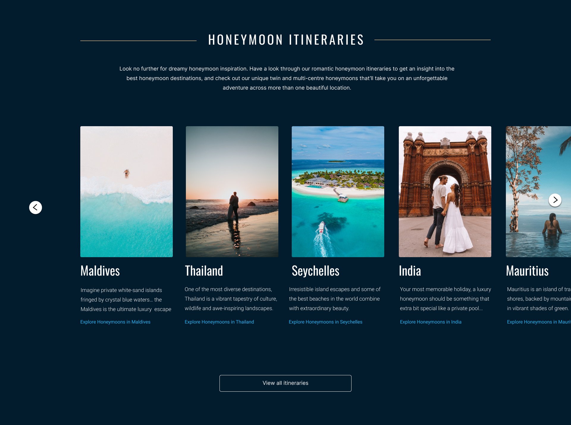
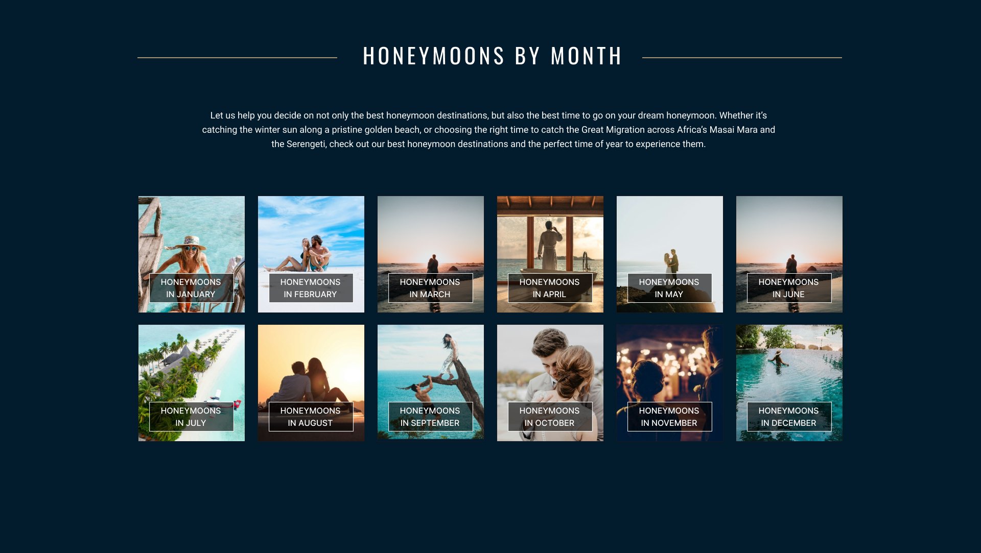
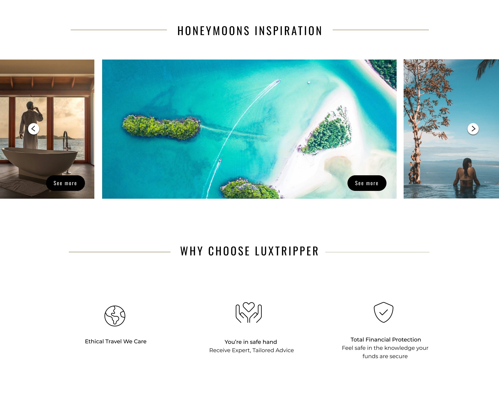
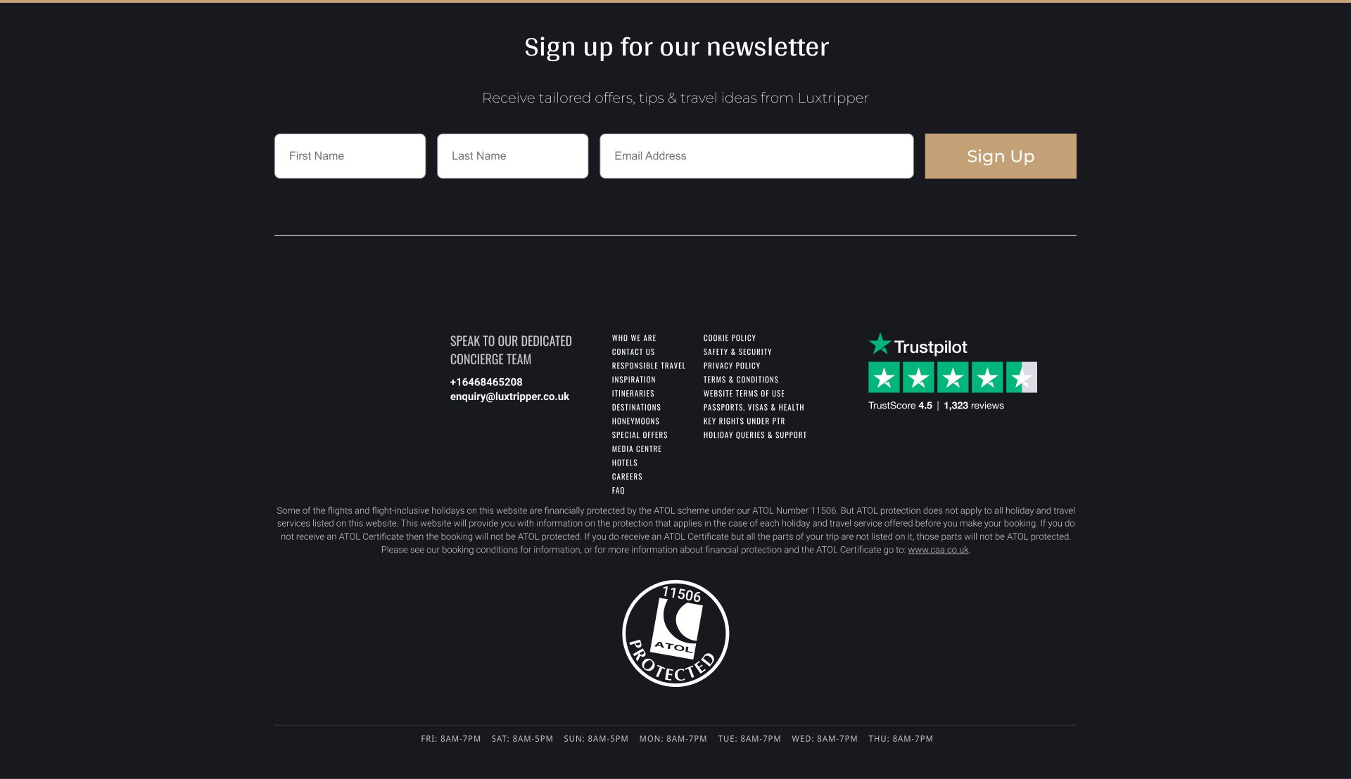
The outcome
Below is desktop landing page tidy up using the system.
View design system