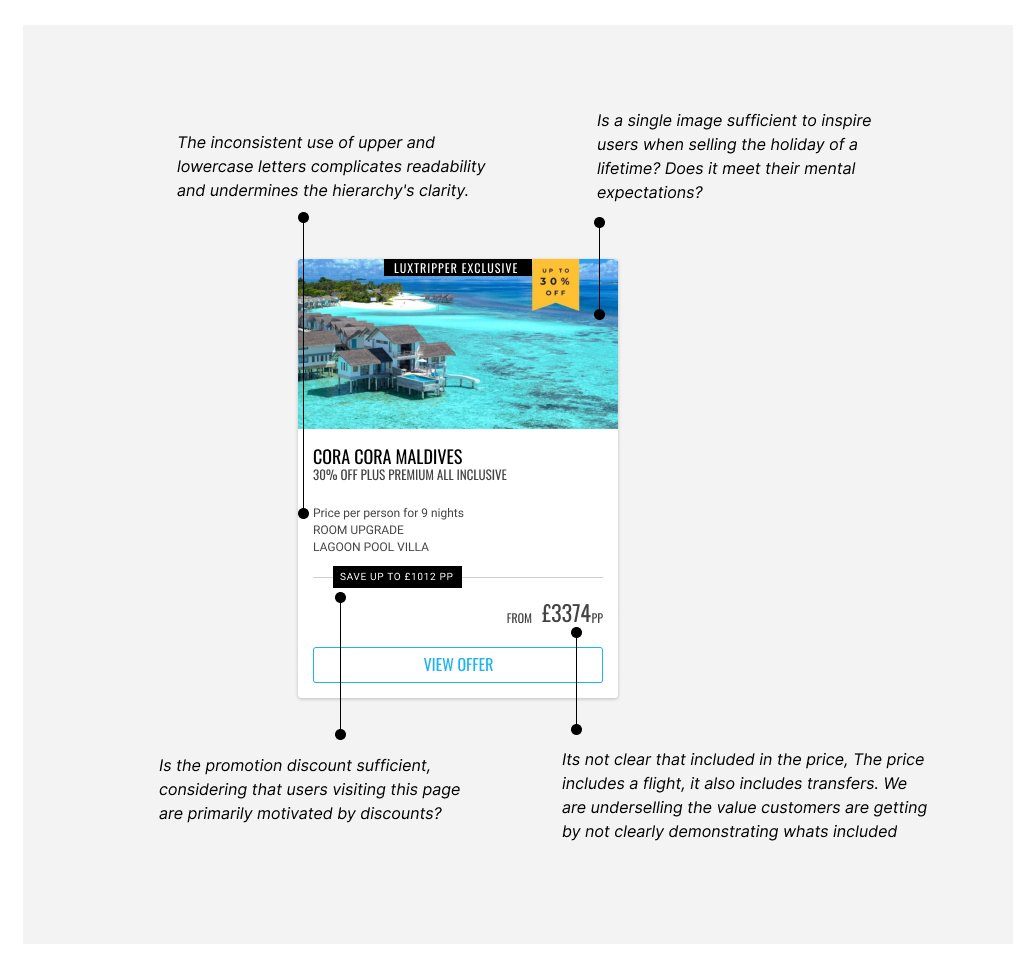
Overview
Luxtripper, a luxury travel agency, aimed to boost its overall conversion rate, optimise marketing expenditure, and decrease the cost per lead. A high bounce rate of 80% on one of our busiest offers pages prompted a reevaluation of our customer journey and value proposition.
The problems
A high bounce rate of 80% on one of our busiest offers pages prompted a reevaluation of our customer journey and value proposition. This impacted our marketing ROI, we believed users were experiencing a sub-optimal experience and we wanted to understand why.
Challenges
Limited Capacity: The team was managing multiple projects, necessitating swift and impactful solutions.
Resource Constraints: No new data could be added to the card designs due to limited resources (e.g., inability to add TripAdvisor scores).
My role
User Research
Lead designer
Interaction designer
Visual designer
Prototype
Design system
Project manager
Approach
To tackle the high bounce rate, we adopted a data-driven, incremental improvement approach:
Analysis:
Leveraging Google Analytics (GA) data to identify the high bounce rate issue.
Understanding the Audience:
Realising our customers, though having substantial budgets, were seeking the best value.
Incremental Testing:
Implementing small, manageable changes and systematically testing them to gauge their impact based on our learnings.
Deliverables
A step-by-step plan to reduce the bounce rate, focusing on quick, impactful changes to a wide audience for maximum impact, making incremental improvements to improve marketing expenditure efficiency.
Goals
Reduce bounce/exit rate
Increase in the number of leads generated by 5%
Reduce Cost Per Click & Cost per lead
Unmoderated user testings
We conducted a series of first impressions unmoderated tests with ten users to gather their opinions on the current execution. Something we had very little data on and only anecdotal thoughts on what users expected to see. These tests aimed to evaluate the effectiveness of our current experience. Are we doing a good job? An 80% bounce rate suggested users weren’t seeing what they were looking for, our research sought to identify why. Were we bidding on the wrong terms or failing to live up to expectations?
Users provided feedback on all devices. Simulating the experience users normally go through to reach our pages and conducting an impressions test, including visual appeal, clarity of information, and overall usability. Users experienced issues understanding what was included in the offers, inclusions weren’t clear (flights & transfers) and users had questions about how the get from one location to another, a service we provided and was included in the retail price.
This feedback was instrumental in refining our problem statement ensuring that we thoroughly understood user expectations and needs.


How might we improve our special offer card to improve our value proposition and visual appeal and make it easier for users to contact agents?
Problem Statement
Customers seek the best travel offers tailored to their needs. Our current special offer cards, displayed on high-traffic pages, lack detailed information and engaging design. We aim to boost lead generation by enhancing the design of these cards to improve the clarity of our value proposition and user engagement and encourage more enquiries.
Hypothesis
Redesigning the offer cards to feature cleaner layouts, captivating hotel images, larger savings font, prominent CTAs, consistent bullet-point formatting, and explicit flight & transfer details will enhance user engagement and drive better conversion rates.


Underselling our value proposition
I realised that the discounted cards, which showcased attractive offers, were underperforming in communicating the true value they held. To address this, I initiated a redesign of these cards. The aim was to extract and emphasise key information that highlighted the exceptional value embedded within these offers. By reworking the presentation of these offers, the focus was on highlighting the substantial value they carried, thus better meeting the expectations and desires of our customer base.
Finding inspiration Traditional travel agent windows
Seeking inspiration on how to best demonstrate value, we decided to examine attention-grabbing deals commonly used by high-street travel agents to see what lessons we could learn from them.


ideas
Using the information we had learned through research, we began to construct a visual representation of our ideas. Once we had designs that we believed addressed some of the issues we identified, we conducted a round of testing using 5-second tests to gather first impressions.


First impressions test
Users were drawn to the version we selected below, and it appeared to address some of the challenges we faced in highlighting value.
“The price seems really good as it includes your flights and transfers .”
User 3 – fivesecondtesting.com


The results
Following the redesign of the special cards, the impact was profound. The exit rate, which previously posed a challenge, decreased by a substantial 23%. This reduction signified a more engaging and appealing user experience.
Notably, the number of offers users explored saw a marked increase, aligning with the goal of enhancing user interaction with the available offerings. There was a notable 120% rise in the number of users requesting quotes, indicating a heightened interest in the offerings presented.
The redesigned special cards, which now effectively highlighted the value of the offers, had a cascading effect on conversion metrics. Conversions saw a remarkable surge, with an impressive 110% increase in overall form submissions.
The impact on conversion rate was extraordinary, skyrocketing by a staggering 357%. This comprehensive improvement in various conversion metrics demonstrated the significant success of the redesign in driving user engagement, interest, and ultimately, conversion.
“This optimisation has significantly reduced our acquisition costs, bringing them down by £12 per lead.”
Conclusion
The redesign of the special offer cards successfully tackled the high bounce rate by emphasising value, enhancing visual appeal, and boosting user engagement. This project underscores the importance of a data-driven, user-centred design approach. Although this case study involved relatively light research, the results demonstrate what can be achieved with a limited budget and resources when data is used to prioritise improvements. This approach has significant potential to drive substantial business outcomes.