357% uplift in with offer card redesign
A walk through of our redesign process.

Introduction
Luxtripper is a luxury travel company specialising in high-end holidays, offering customers the opportunity to create bespoke itineraries tailored to their desires. In my role at Luxtripper, I initiated a programme of continuous optimisation, focusing on implementing incremental UX enhancements to drive performance improvements. The following case study illustrates the impact of strategically displaying information to the appropriate user cohorts at the optimal stages of their journey.
My role
A high bounce rate of 80% on one of our busiest offer pages prompted a re-evaluation of our customer journey and value proposition. This impacted our marketing ROI; we believed users were experiencing a sub-optimal experience, and we wanted to understand why.
Challenge
Limited Capacity: The team was managing multiple projects, necessitating swift and impactful solutions.
Resource Constraints: No new data could be added to the card designs due to limited resources (e.g., inability to add TripAdvisor scores).
Client
Luxtripper
Project scope
3 Designers, 1 Product Owner, 1 Project Manager, 1 Product Delivery Manager, a team of internal developers, Compliance team
Tools
Figma, Adobe CC, Trello, Miro, Axure, Jira, Teams


Overview of our approach
Faced with a high bounce rate of 80% on one of our busiest offers pages, we recognised the need to reassess both our customer journey and value proposition. This issue was not only affecting user experience but also impacting our marketing ROI. We hypothesised that users were encountering a sub-optimal experience and sought to uncover the underlying causes.
To address the high bounce rate, we employed a data-driven strategy focused on incremental improvements:
Analysis:
We utilised Google Analytics (GA) to pinpoint the extent and specifics of the bounce rate issue.
Understanding the Audience:
Despite having substantial budgets, a large cohort of our customers were motivated by finding the best value. We needed to align our offering with this mindset.
Unmoderated User Research:
To gain quick and actionable insights, we conducted unmoderated user research. This approach allowed us to rapidly gather feedback and identify pain points without the delays associated with moderated sessions.
Incremental Testing:
We introduced small, manageable changes and systematically tested them to measure their impact, continuously refining our approach based on the insights gained.
Research
We conducted a series of first-impression unmoderated tests with ten users to gather their opinions on the current execution—an area where we previously had little concrete data and only anecdotal insights into user expectations.
These tests aimed to evaluate the effectiveness of our current user experience. Were we truly meeting user needs? An 80% bounce rate strongly suggested that users were not finding what they were looking for. Our research sought to uncover the reasons behind this: were we bidding on the wrong terms, or were we simply failing to meet user expectations?


Userbrain: Unmoderated first impressions test
Users of Luxtripper
Understanding our value-driven cohort of users and their first impressions.
Understanding our value-driven cohort of users and their first impressions.
We gathered feedback from users across all devices, simulating the typical journey they would take to reach our pages. This included conducting first-impression tests that assessed visual appeal, clarity of information, and overall usability.
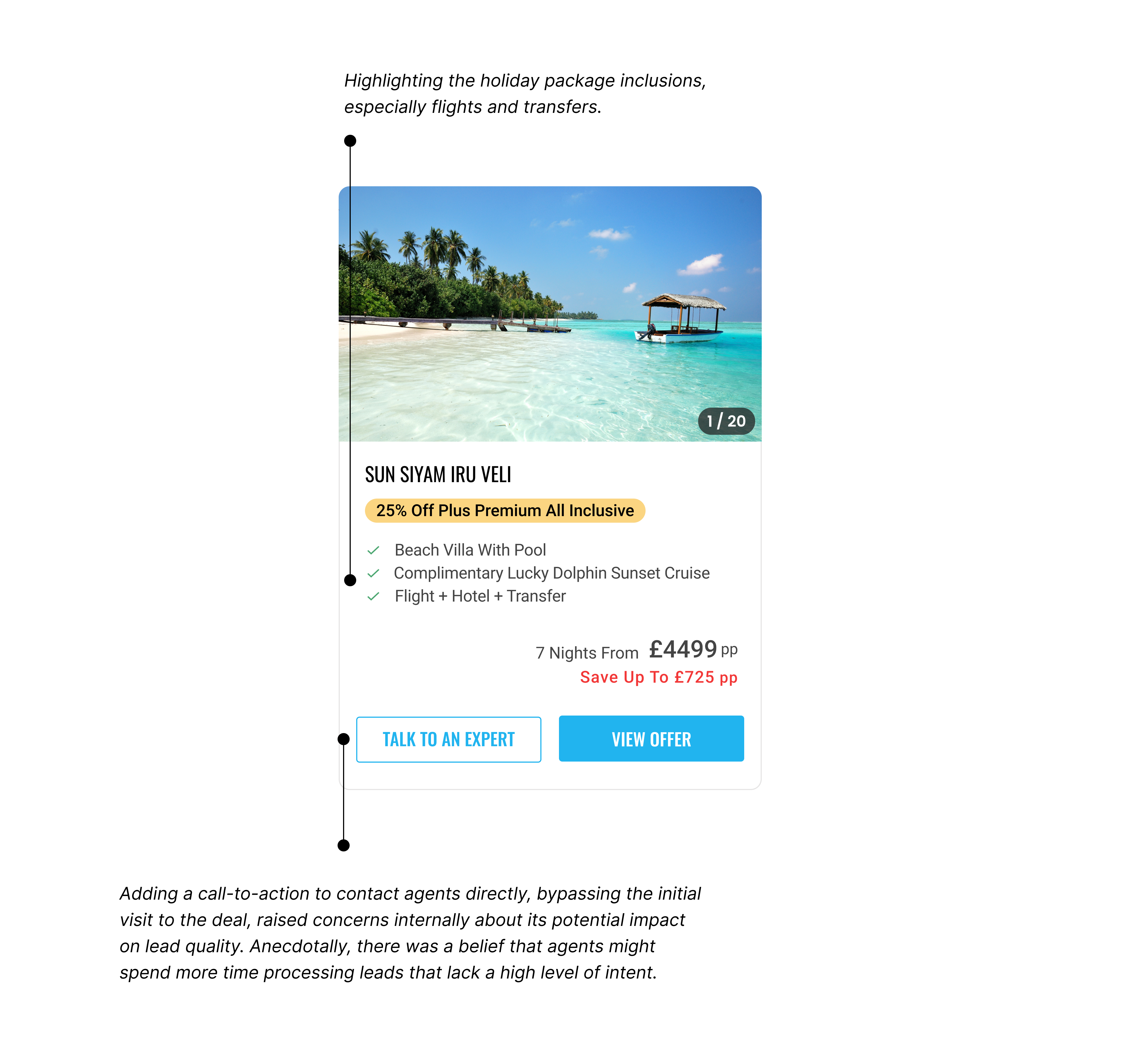
Users encountered issues understanding what was included in the offers. Key details, such as flights and transfers, were not clearly communicated, leading to questions about how to travel between locations—a service we provided and included in the overall price.
This feedback was instrumental in refining our problem statement, ensuring we had a comprehensive understanding of user expectations and needs.
Summary of Research Findings
Information Overload:
Excessive text and visuals overwhelmed users, making it difficult for them to comprehend the key information
Underselling value proposition:
A lack of clarity regarding flight and transfer inclusions led users to mistakenly believe these were hotel-only deals.
Savings Hierarchy:
The savings information was often overlooked due to its small font size and the white-on-black text, reducing its visibility.
Unclear CTA:
The absence of a clear “Contact About This Offer” button, particularly for mobile users, resulted in missed engagement opportunities.
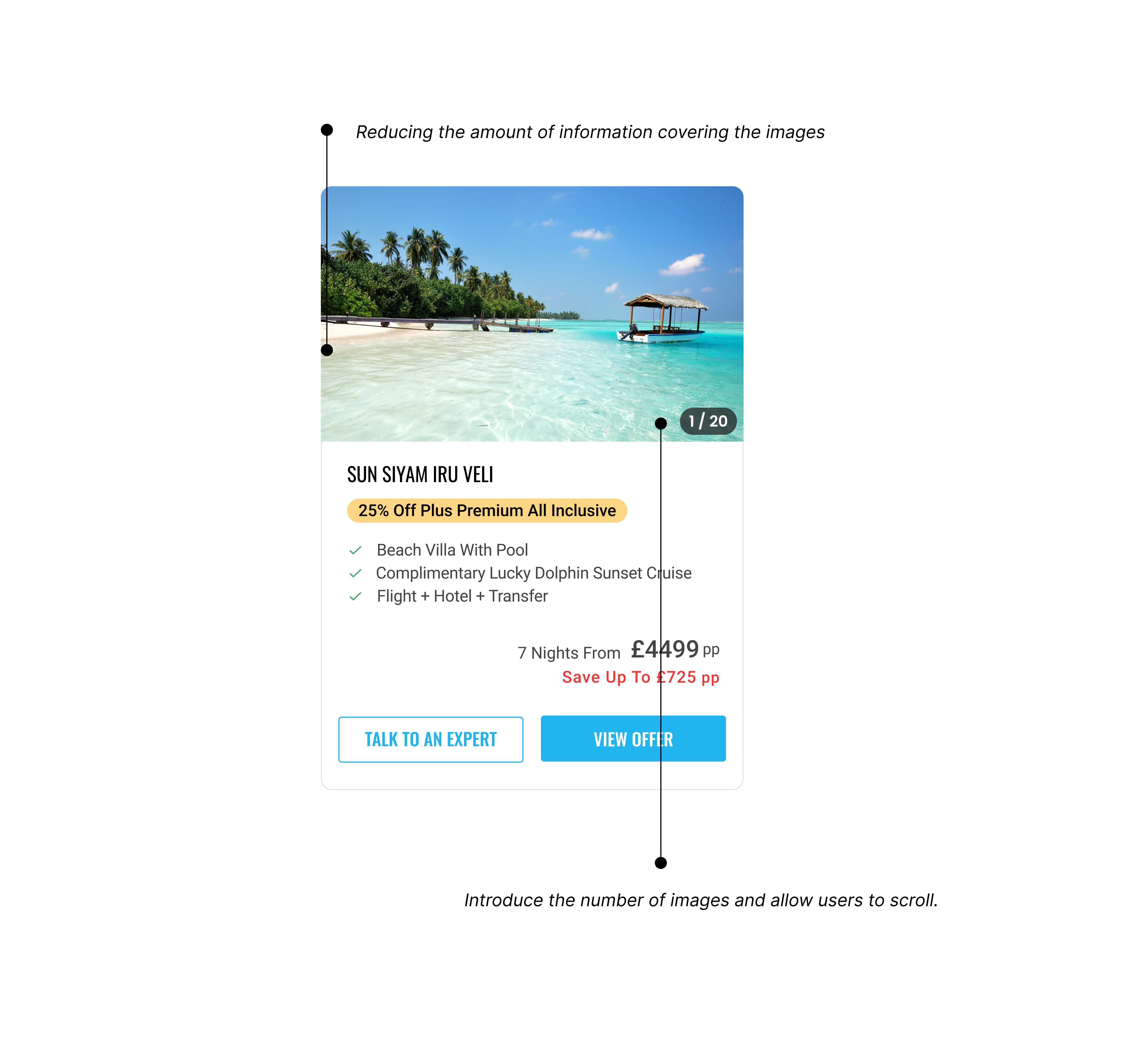
Partially Covered Images:
The visual appeal of hotel images was diminished due to them being partially covered by text or other elements.
Inconsistent Formatting:
The inclusions lacked consistent capitalisation, leading to a less polished and professional appearance.
Limited Filtering Options
Currently, users must search through all destinations and holiday types, making it difficult to find relevant content.

Current card design for offers
Opportunities
How might we…
Enhance our special offer cards to strengthen our value proposition?
Make it easier for customers to contact our agents?
Improve the visual appeal of our special offers to make them more desirable and compelling?
Increase the relevance of the offers displayed?
Ideation and Visual Design
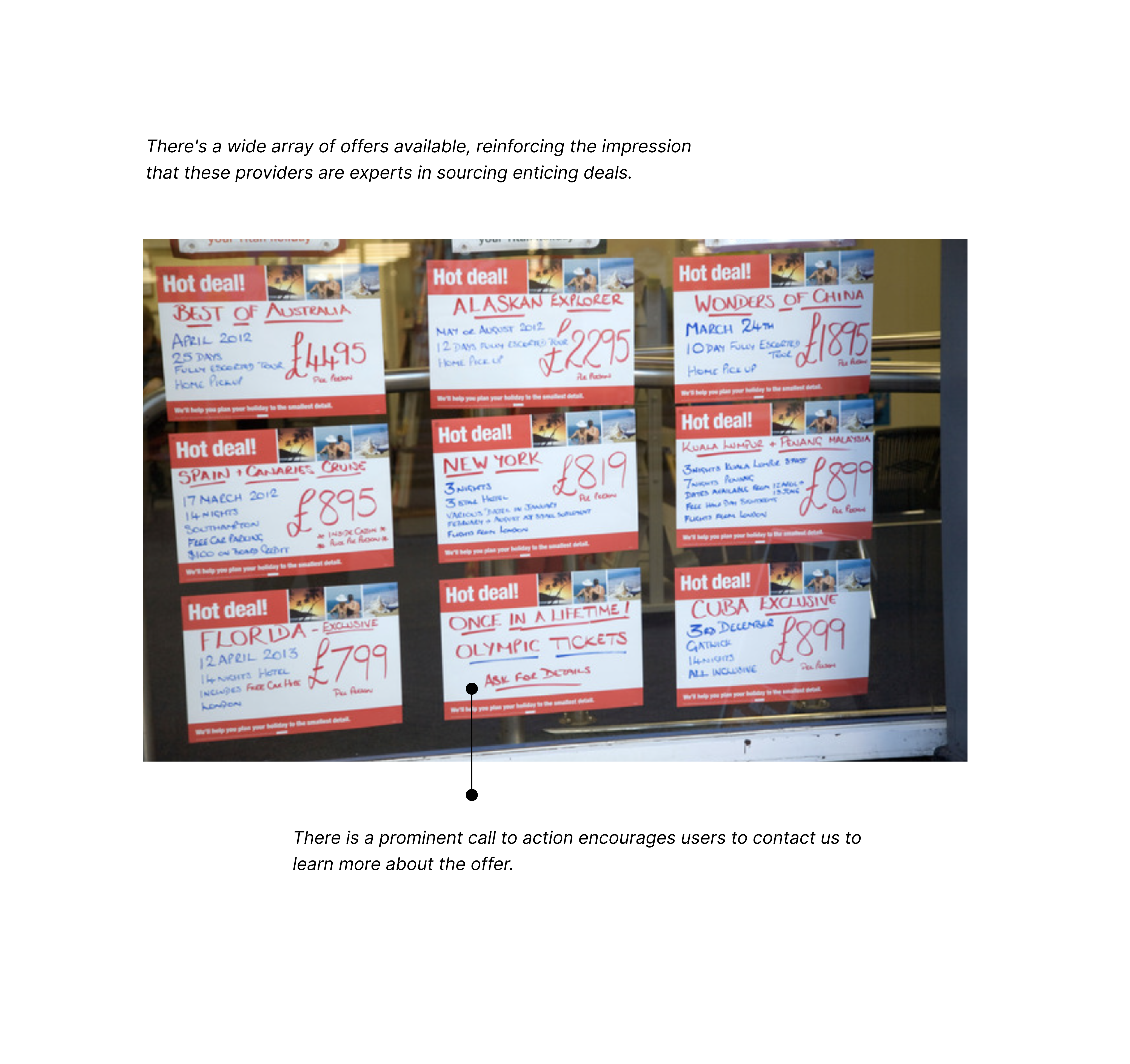
Finding inspiration on the high-street.
To discover the best ways to demonstrate value, we examined attention-grabbing deals commonly used by high street travel agents, seeking lessons we could apply to our own approach.

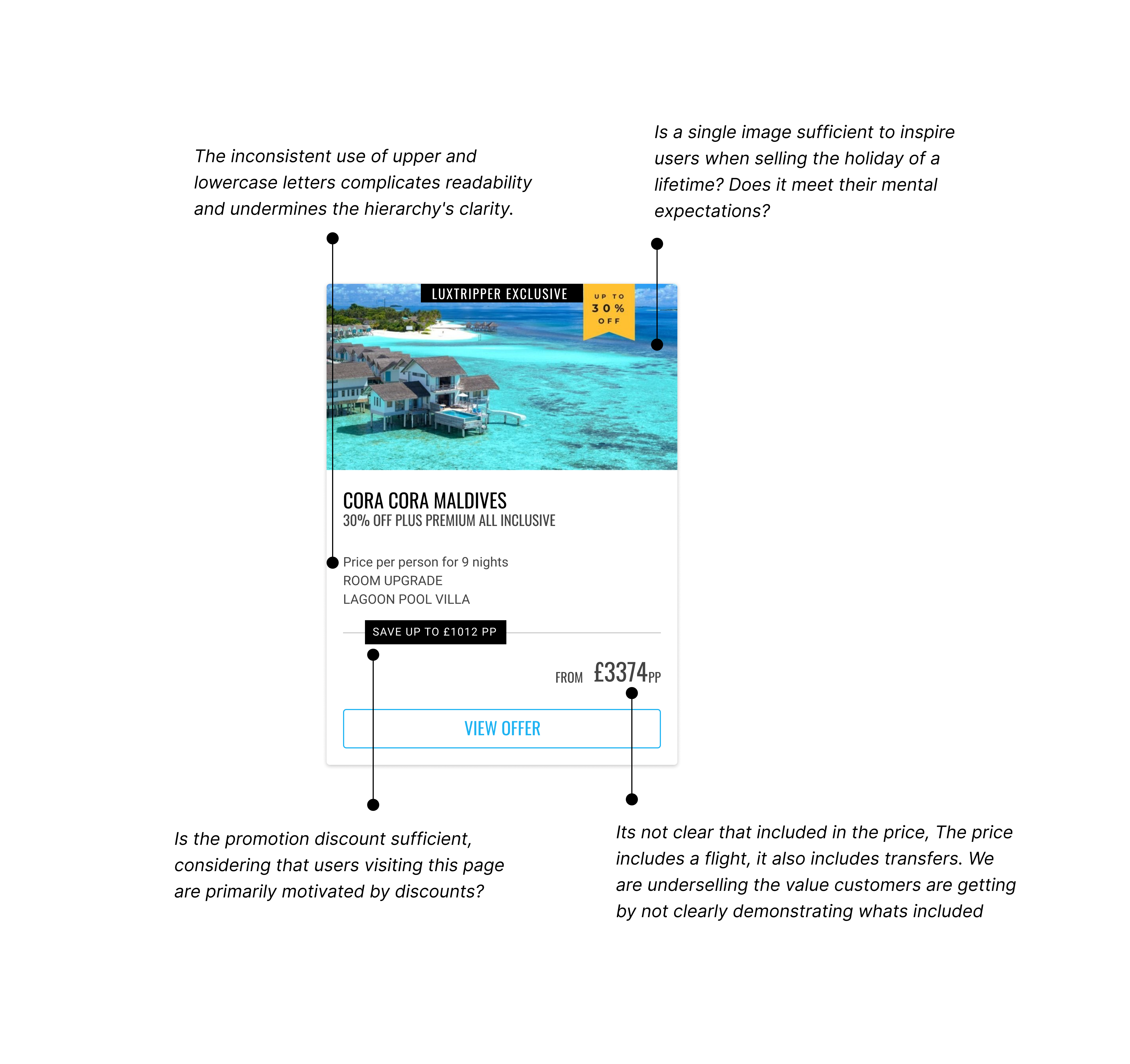
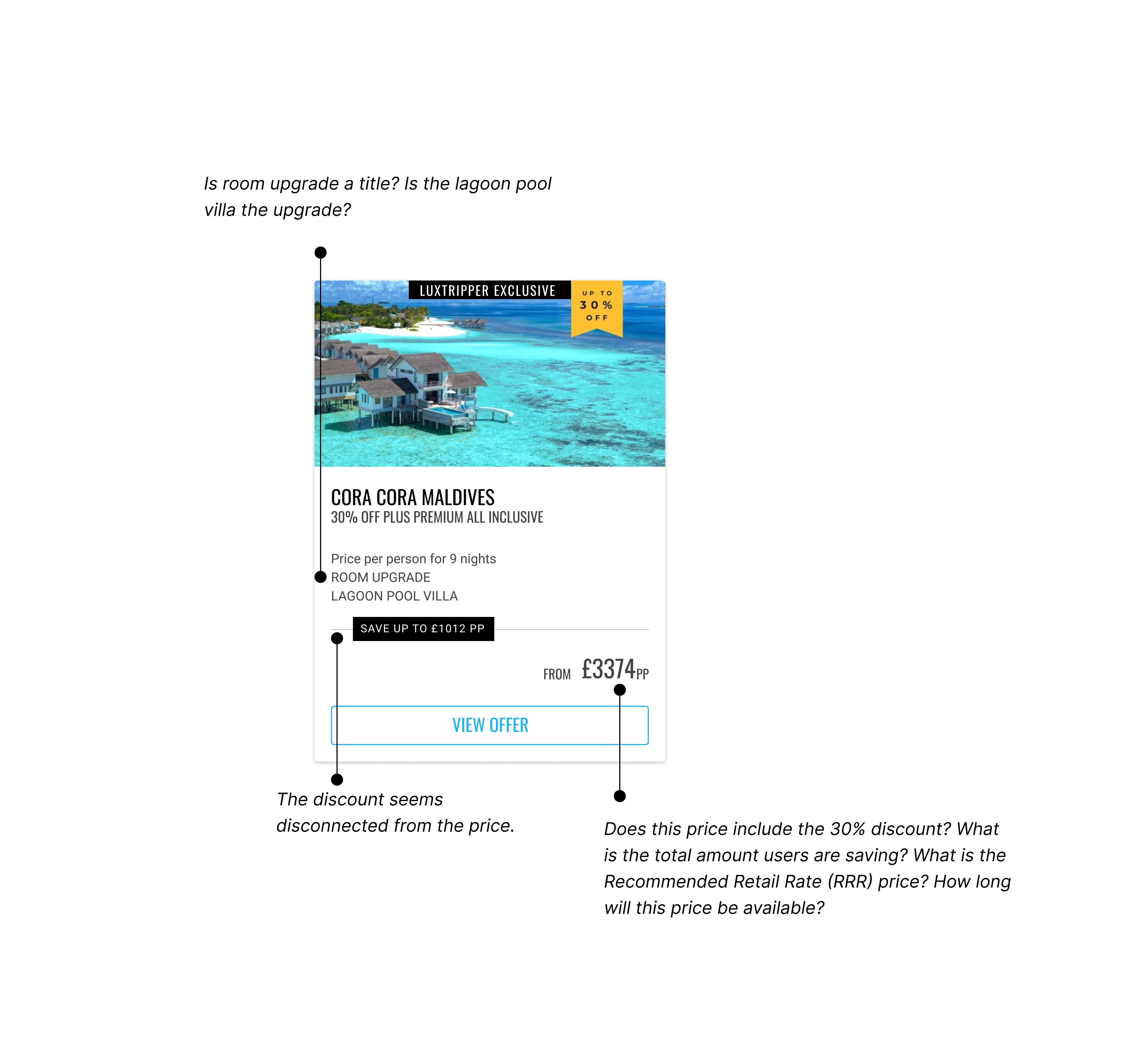
Visual Teardown of Current Design
Why are the current offer cards underperforming?
Customers seek the best travel offers tailored to their needs. Our current special offer cards, displayed on high-traffic pages, lack detailed information and engaging design. We aim to boost lead generation by enhancing the design of these cards to improve the clarity of our value proposition, increase user engagement, and encourage more enquiries.
Our offers were underperforming in communicating their true value. To address this, I initiated a redesign of these cards with the goal of extracting and emphasising key information that highlights the exceptional value embedded within these offers. By reworking the presentation, we focused on showcasing the substantial value they carried.
Ideas
Utilising user research to define our solution.
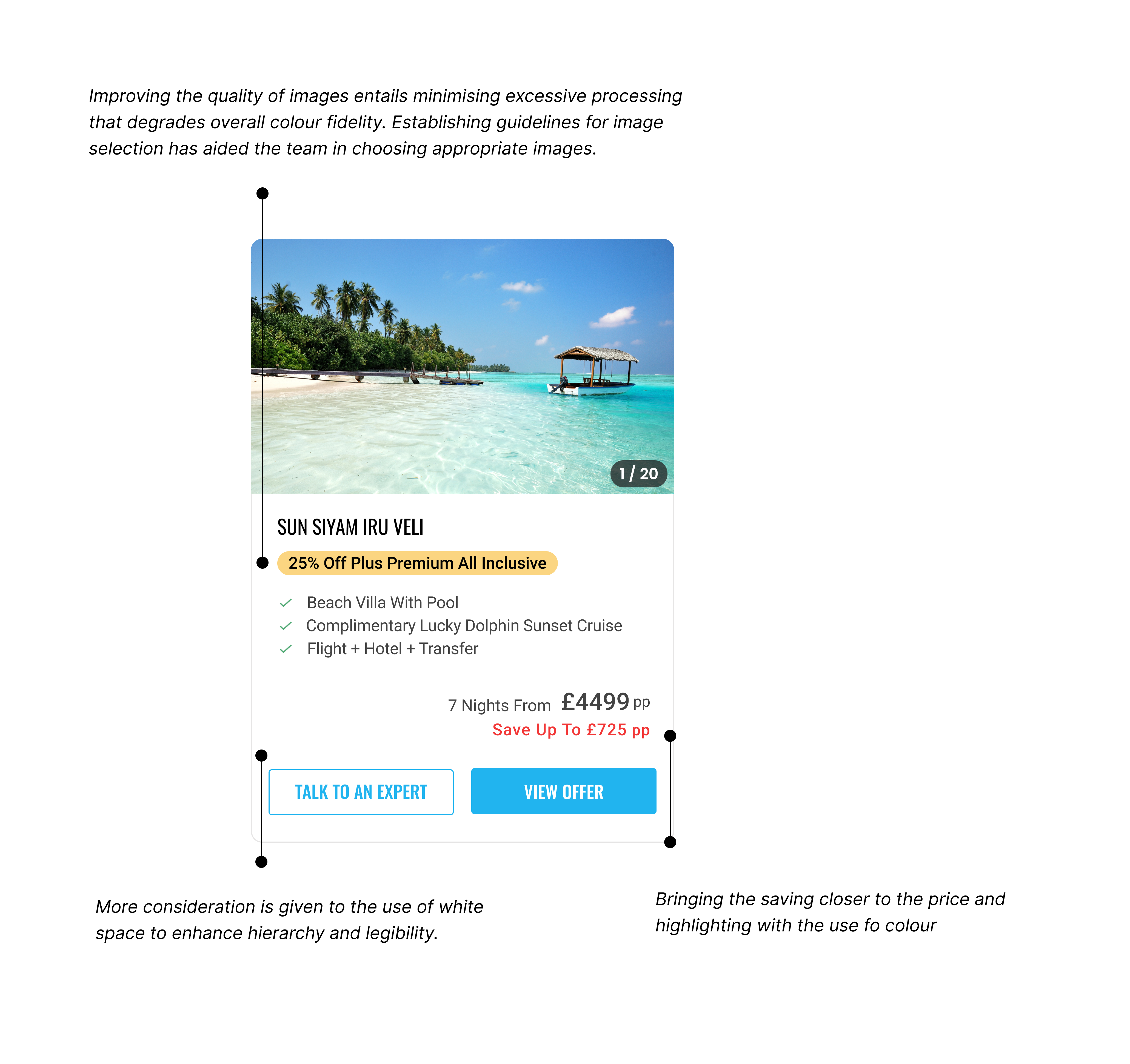
Drawing on the insights from our research, we recognised the need to redesign the offer cards to enhance user engagement and improve conversion rates. Our approach involved creating cleaner layouts, featuring captivating hotel images, enlarging savings information, and making CTAs more prominent. We also aimed to standardise formatting and clearly present flight and transfer details.
With these elements in mind, we developed visual mock-ups of our redesigned offer cards. Once these designs were finalised, we conducted 5-second tests to capture initial user impressions and ensure that the new designs effectively addressed the issues identified in our research.
Hypothesis
We believe that redesigning the offer cards to feature cleaner layouts, captivating hotel images, larger savings, prominent CTAs, consistent bullet-point formatting, and explicit flight and transfer details will enhance user engagement and drive better conversion rates.
1st draft ideas


Defining and Prioritising Solutions
What were the results?
Following the redesign of the special offer cards, the impact was profound. The exit rate, which had previously posed a challenge, decreased by a substantial 23%, indicating a more engaging and appealing user experience.
Notably, the number of offers explored by users increased significantly, aligning with our goal of enhancing user interaction with the available offerings. There was a remarkable 120% rise in the number of users requesting quotes, reflecting heightened interest in the presented offers.
The redesigned offer cards, now effectively highlighting the value of the offers, had a cascading effect on conversion metrics. Conversions surged, with a striking 110% increase in overall form submissions.
The impact on the conversion rate was extraordinary, skyrocketing by an impressive 357%. This comprehensive improvement across various conversion metrics demonstrated the significant success of the redesign in driving user engagement, interest, and, ultimately, conversions.

Next Steps
Conclusion…
The redesign of the special offer cards effectively addressed the high bounce rate by highlighting value, enhancing visual appeal, and increasing user engagement. This project demonstrates the power of a data-driven, user-centred design approach. Despite the relatively limited research and budget, the results highlight how prioritising improvements based on data can lead to significant outcomes.
This approach not only has the potential to drive substantial business results but also supports the adoption of data-driven design strategies. By continuously iterating on designs and testing new variants, we can further refine the special offer cards. While the current redesign may not be the final version, the process of rapid iteration and testing ensures that we can identify and implement the most effective solutions as long as results continue to improve.